This page is built to convert visitors who already trust the landing page and now want a clear breakdown of consultation types, process and what happens after booking.
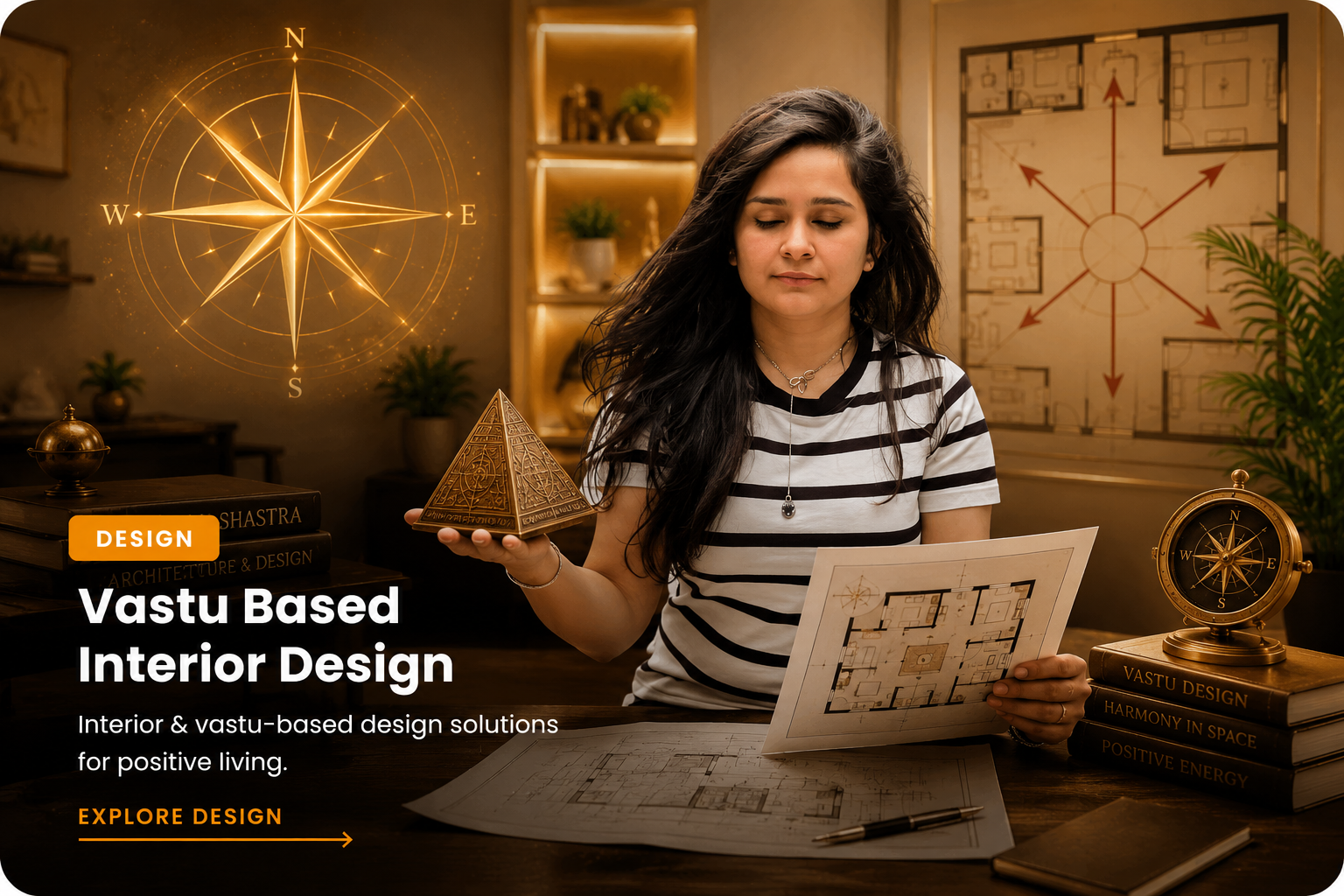

Ideal for entrances, kitchen layout, bedroom placement, family harmony and overall space flow.

Useful for office cabins, seating, reception areas, decision zones and productivity-related concerns.
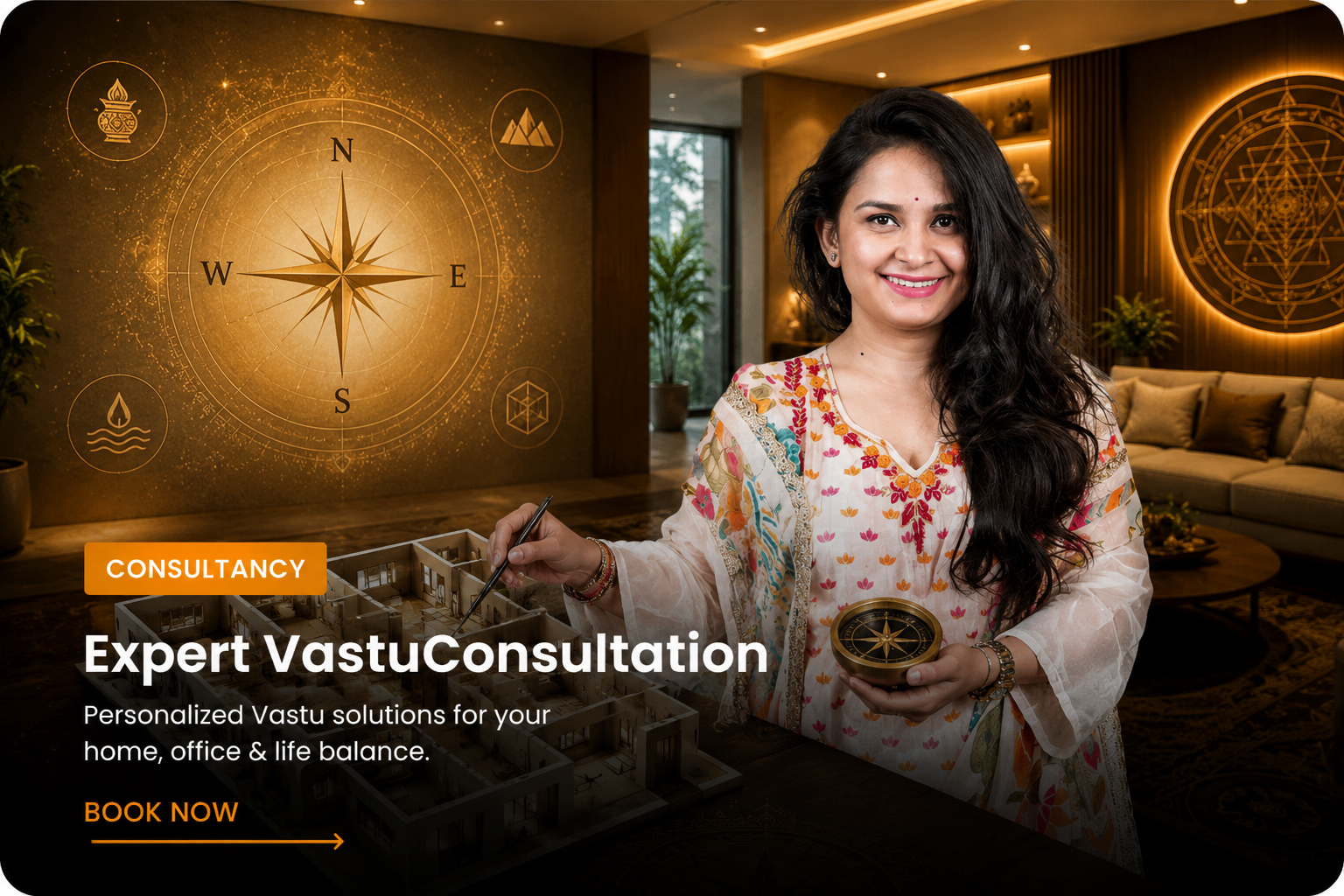
Designed for spaces where function, customer flow and business alignment all matter together.
Keeping this dark section mirrors the diagnostic zone from your landing page and creates strong visual continuity.
Repeated conflict, emotional heaviness or discomfort in your living environment.
Business or financial progress that feels slower than the effort being invested.
A space that does not feel supportive for clarity, focus or decision-making.
Guidance needed before construction, interior planning or layout changes are finalised.
The client shares the property type, main concern and available details.
Layout, directions, photos or floor plans are assessed before the session.
The guidance session covers observations, priorities and practical direction.
The client leaves with clarity on changes, corrections or areas to focus on.
The landing page already promises flexibility, so this inner page expands on it with enough detail to remove hesitation and help visitors self-qualify before reaching out.
No. If one is available it helps, but a consultation inquiry can still begin without it.
Yes. The page is structured to support online consultation enquiries from anywhere.
That should be one of your strongest positioning points: realistic, clear and situation-based guidance.
This closing section matches the same premium conversion tone as the home page while being more service-focused.